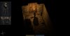
I like the low health warning, but the super bright red surrounding the entire screen is a bit much. It might look cooler if it were a duller shade, it covered a bit less of the screen (or maybe coverage could be a function of just how close to death you are) and was accompanied by some other visual effect such as blurring on the edge or loss of vision entirely, to simulate your imminent loss of consciousness.
Exanima 0.5.1 Released
- Thread starter Madoc
- Start date
-Tim-
Insider
Soon™когда выйдет продолжение вне подземелья
Faelivrin
Insider
In two weeks if we are luckyкогда выйдет продолжение вне подземелья
Yoji
Supporter
Hi all,
Thank for this nice update.
Except, personally i don't like the low health warning (glad to see it isn't in arena mode), i think it's a visual pollution, especially for third person games. The sound of heart not trouble me, but maybe it's a sound pollution for another player.
Perhaps it would be good if the player can choose to activate or not the low health warning, because it's really not a necessary effect.
TwoPumpWarrior
Insider
I have yet to see this low health warning, I'm just too good! xD
Mood: Very impatiently waiting for a post from Madoc
Mood: Very impatiently waiting for a post from Madoc
Last edited:
Balgin the Dwarf
Insider
I've been getting the Lethal Continue Button bug a lot today. Never experienced it before this update. It seems to be related to Arena runs. I play some campaign, take a break to play some arena. Come back to the campaign and am immediately transformed into an unrecognisable corpse plummeting from the ceiling of the starting area.
Faelivrin
Insider
First iteration of a global skill system in about a week.So, what's next on the development schedule?
Пардон, а какой смысл здесь писать на русском?
Да, дверь открывается тем же ключом, что и та, которая была слева. Но сейчас присутствует баг, не позволяющий вернувшись на уровень снова использовать ключи там найденные. Разработчики знают об этой проблеме и, стало быть, скоро её решат.
_________________
Sorry, but what's the point of posting here in russian?
Yes, that door can be opened using the same key that unlocks the door to the left of the starting area. But currently there's a bug preventing you from using keys found on the level you're back on. Developers are aware of the problem and will fix it ASAP.
It should be fixed as of 0.6.0.1
Last edited: